Product Design through Collaboration

I teamed up with three classmates to conduct UX research and create prototypes for redesigning Suzanne Collins' website. We conducted surveys, user testing, and collaborated closely on documentation and a presentation. Each of us independently created prototypes based on our own perspectives. This project boosted our design and teamwork skills, aiming to enhance user experience on the author's website.
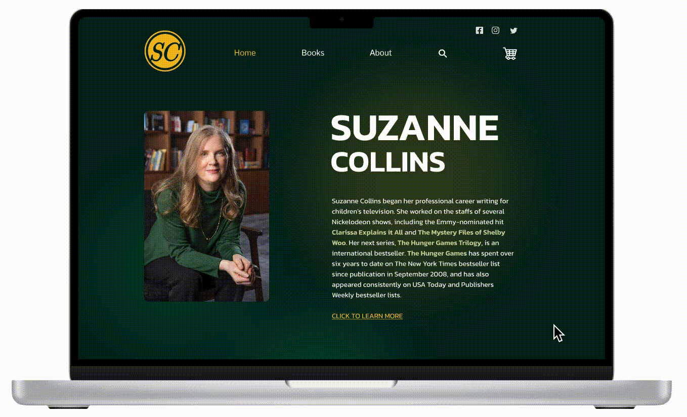
Figma Prototype
Challenges: Users faced difficulty navigating "The Hunger Games" author Suzanne Collins site, there was no internal way to purchase books, the site had poor contrast, and it was hard to distinguish links and text. Overall, the site looked unappealing and unprofessional.
Goals: Increase book sales and enhance the user experience.

Methods: We conducted user tests, including surveys, and compiled the data into documents. Users were given tasks to complete on the website while describing their actions.
Findings: Users found the website confusing and cluttered, with no way to purchase books. It had low contrast, and unprofessional aesthetics. An improved design with an integrated online bookstore was crucial.


Developing personas to represent user groups.


Ideation: Brainstormed solutions included improved colors, fonts, layout, and building an online bookstore directly on the site. Knowing that users would feel more trusting buying from the author's website, integrating the bookstore was vital.
Wireframes: Created initial low-fidelity wireframes showing the bookstore integrated into the site and different page layouts.
Prototypes: Developed high-fidelity prototypes demonstrating the new features.

Testing Methods: Conducted usability testing sessions using my current Figma prototype. Tasks were assigned, and users were asked to narrate their actions to pinpoint any usability challenges.
Feedback: Users appreciated the improved layout and integrated bookstore but suggested adding a "see more" button for each book to open a detailed page with summaries and additional information.
Iterations: Implemented a "see more" link for each book, leading to a dedicated page with more details.

Visual Design: The final design featured a clean, user-friendly interface.
Features: Integrated bookstore, search bar, improved fonts, colors, and overall site layout.
Mobile Prototype: Developed a mobile layout for the bookstore page.


Results: The redesign is expected to increase book sales and received positive user feedback.
Impact: Improved user satisfaction, expected higher book sales, and a better overall experience for learning about Suzanne Collins and her books.
Lessons Learned: Throughout the project, we learned the significance of setting clear expectations, effective communication and staying updated on progress. Using a project management software could have helped us in dividing tasks and having clear communication.
Future Improvements: Plan to further refine the mobile UX of the website and continue regular checkups to ensure it meets users' needs.