Transforming RetroFit’s Digital Presence with Branding & Web Design

As a UX & Brand Designer at Envision Data, I developed the brand identity and website for RetroFit, a sports brand specializing in athlete-focused meal plans, branded merchandise, and a food truck selling healthy meals. In Phase 1, we launched a website to showcase the brand, featuring a home, about, and contact page. I created the logo, typography, and color palette, along with a brand guide. I also designed the meal menu, aligning it with the brand’s clean and performance-driven aesthetic. Phase 2 will introduce an online shop for meal plans and merch, expanding RetroFit’s digital presence.
retrofitaz.com
RetroFit’s digital presence was limited to Instagram, which made it challenging to establish credibility and attract investors and clients. To enhance its brand perception and create a more trustworthy, professional image, RetroFit needed a website and cohesive branding that could effectively showcase its offerings and values.
To create a strong and cohesive brand identity for RetroFit, I carefully selected colors that aligned with the brand’s aesthetic and ensured they worked effectively on the black background the client preferred. I conducted contrast ratio tests to confirm readability and accessibility, refining the shades and tints to maintain visual balance. For typography, I sourced and selected fonts for the logo that complemented the brand’s bold, athletic image, and I chose a versatile font family for body text to ensure clarity across all digital and print materials. All these elements were compiled into a comprehensive branding guide, providing clear direction for maintaining a consistent and professional visual identity.


I designed the menu for RetroFit’s premade meal plans, showcasing their selection of high-protein meals in a clear and visually appealing layout. The design maintained consistency with the brand’s aesthetic while ensuring readability and ease of use. By organizing the menu effectively, I helped create a professional and cohesive presentation that enhances the customer experience.

Using Balsamiq, I designed the wireframe for RetroFit’s website layout with a focus on creating a clear and functional structure that aligned with the client’s vision. After the initial design, I met with the client to review the layout and ensure it met their goals of showcasing the brand, attracting investors, and establishing credibility. This step allowed for early feedback and refinements, creating a strong foundation for the final design.

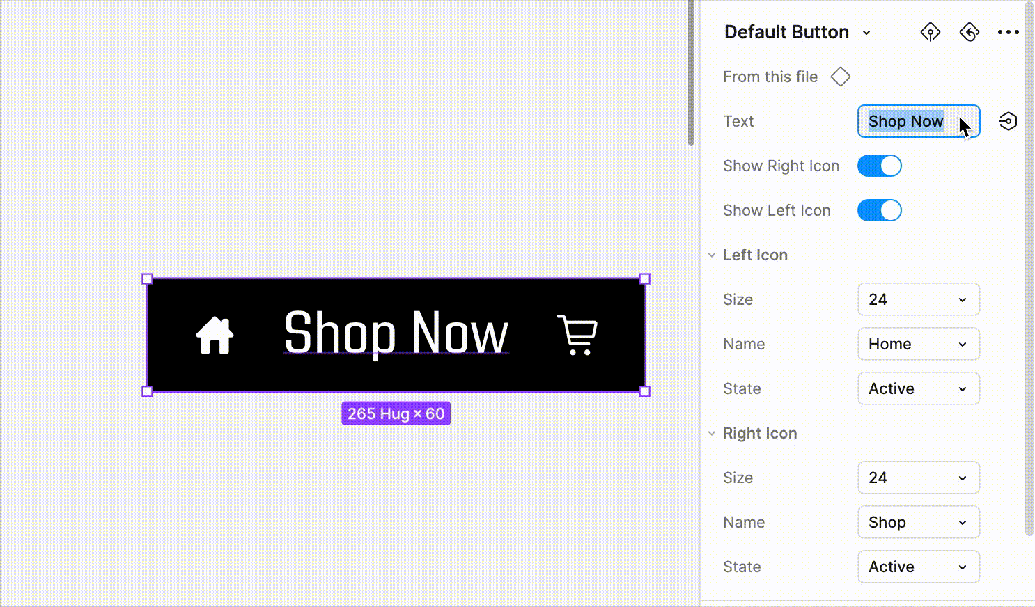
The button component uses auto-layout and has customizable settings to change the text, icons, and visibility of items in the button.
Establishing a system of color variations.

Using tokens to apply the primitive colors for different uses, making changes easy. Different token versions allow for Dark and Light themes.

Establishing styles for text and grids, and applying those for the appropriate uses to ensure consistency and easy updates.

Starting with a mobile-first approach, the website was designed to ensure a seamless user experience across all devices. After finalizing the mobile layout, the desktop prototype was created. The client was then consulted to review the design and provide feedback, ensuring it aligned with their vision and goals. After incorporating their input, the final prototype was handed off to the WordPress developer for implementation, ensuring a smooth transition from design to development.

Developing RetroFit's cohesive branding, menu, and website enhanced their digital presence, building credibility and trust with customers and investors. The polished brand identity and seamless experience contributed to RetroFit’s growth, securing funding and driving customer engagement, with the food truck further expanding their reach. This project reinforced the power of strong design in helping businesses achieve their goals.